
As a general rule, when reconstructing stamping dies I like to work directly from a photograph of the original pot. Looking at the way light hits a stamp impression is the best way for me to understand the way the die would have been carved: which portions are in higher relief, the order of cuts, etc. One of the great challenges is understanding the relationship of negative and positive space – essentially, which parts of the die need to be carved away – and this can be difficult to see in a drawing or a poor-quality photograph. In some cases, I can make do from a line drawing, especially if it’s a stamp type I’m familiar with and can “read” more easily. But the pot from Northfleet in my last post is a great example of why there is no source better than the actual pot.
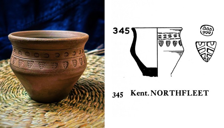
In the first go-round, I cut the stamps based on the line drawing in Myres’ Corpus, one of the seminal volumes on early Anglian/Saxon pottery in Britain. With thousands of illustrations, it is an incredible resource and I have used it as a reference for at least fifty sets of stamp dies. When I cross reference them with photos of the same pots in museum databases online, they have always been accurate – or at least my reading of them has been accurate. When I first saw the Northfleet cup, I was intrigued by the larger, triangular stamp and wanted to reconstruct the die. I tracked down the pot to the museum in Maidstone, Kent, but couldn’t find a photo of the actual object anywhere online. I went ahead and cut the dies for both stamps based on the drawing published in the Corpus, but something about the smaller one (I call it the “coffee bean”) didn’t seem quite right to me.
First off, it did not look like any other stamps I had seen in the book. While there is a huge diversity among the early A&S pottery stamps, they are still mostly variations on a relatively small number of themes, and the coffee bean just seemed…off. Based on the drawing, I actually could not decide what was meant to represent positive vs. negative space. Was it an oval die with six triangular divots cut in it? Or was the majority of the die face cut away aside from six raised, triangular teeth? Neither option made a lot of sense based on my experiences thus far, but I tried it both ways just to see. Cutting such tiny triangular divots was a pain – most cuts were usually lines, while small holes were round and were drilled. Trying the other option involved a lot of effort to carefully remove most of the die face while still leaving the triangular teeth, and I had not yet encountered any die with that large a ratio of material removed vs. material remaining (usually at least 40 percent of the surface area of the die remains, often far more).
In the end, I produced a die that looked like the published drawing, but still just didn’t look quite right to me. Over the holidays, I decided to try a long shot and emailed Maidstone Museum’s collections manager to see if the museum would be willing to send a photograph of the pot. To my delight, they very kindly did so, and boy was I in for a surprise when I opened the email!
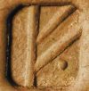
I can see why the photo isn’t out there for public consumption – and why the pot isn’t on display! The collections manager also sent along the accompanying information from the museum database, which noted that both the rim and base of the pot had been reconstructed (presumably these portions were missing from the original find) and that the base was reconstructed incorrectly. While some pots from this period do have foot rings or feet, they don’t look anything like this one and I have no idea why this base was added, although it’s possible it was done a very long time ago by someone who didn’t know any better. Beyond that though, the answer to my question about the coffee bean was immediately resolved, and I spotted a number of inaccuracies in the published drawing.
Firstly, the two horizontal lines don’t actually appear – it looks more like some voids in the fabric of the pot. Secondly, the shape of the larger stamp is much crisper triangle, and there are four branching lines on either side of the central line, rather than the three shown in the drawing. Thirdly, the inscrutable “coffee bean” is in fact a perfectly ordinary stamp made with just a few intersecting lines in a grid pattern – not at all uncommon. It is a rectangle with slightly rounded corners and a wide groove down the long axis, separating two rows of four little teeth. To reproduce it, I made three small cuts across the short axis and then the long central cut, which I made a bit wider and deeper. since this creates a higher raised ridge on the stamps of the original pot. Mystery solved. For comparison, here’s a side by side of the second version, followed by the original set of dies and the published drawing in Myres’ Corpus.

So what lesson did I learn from this? One was simply reinforcing what I already knew – always go back to the original whenever possible. Relying on someone else’s interpretation automatically locks you into whatever assumptions they made or at best, saddles you with whatever hindrances they may have had. In this case, perhaps the illustrator had to work from a poor quality photograph to begin with, or was copying someone else’s drawing. The second lesson is that if something doesn’t look right, maybe it isn’t – if the two possibilities are “this is a super weird thing” or “this is a wonky rendering of a fairly common thing,” it is worth digging a little further to see what is going on. The third lesson is that museums are educational institutions and that the staff may be happy to help you with a reasonable request – and that it can’t hurt to ask. So once again, I’m most grateful to Maidstone Museums for their generous assistance.
